telos.haus is a community and event space in Brooklyn, NY. Created for what began as a three-month pop-up, the identity system is kept light-weight and flexible, prioritizing easy maintenance by anyone with access to a text editor—staying out of the way while remaining present.

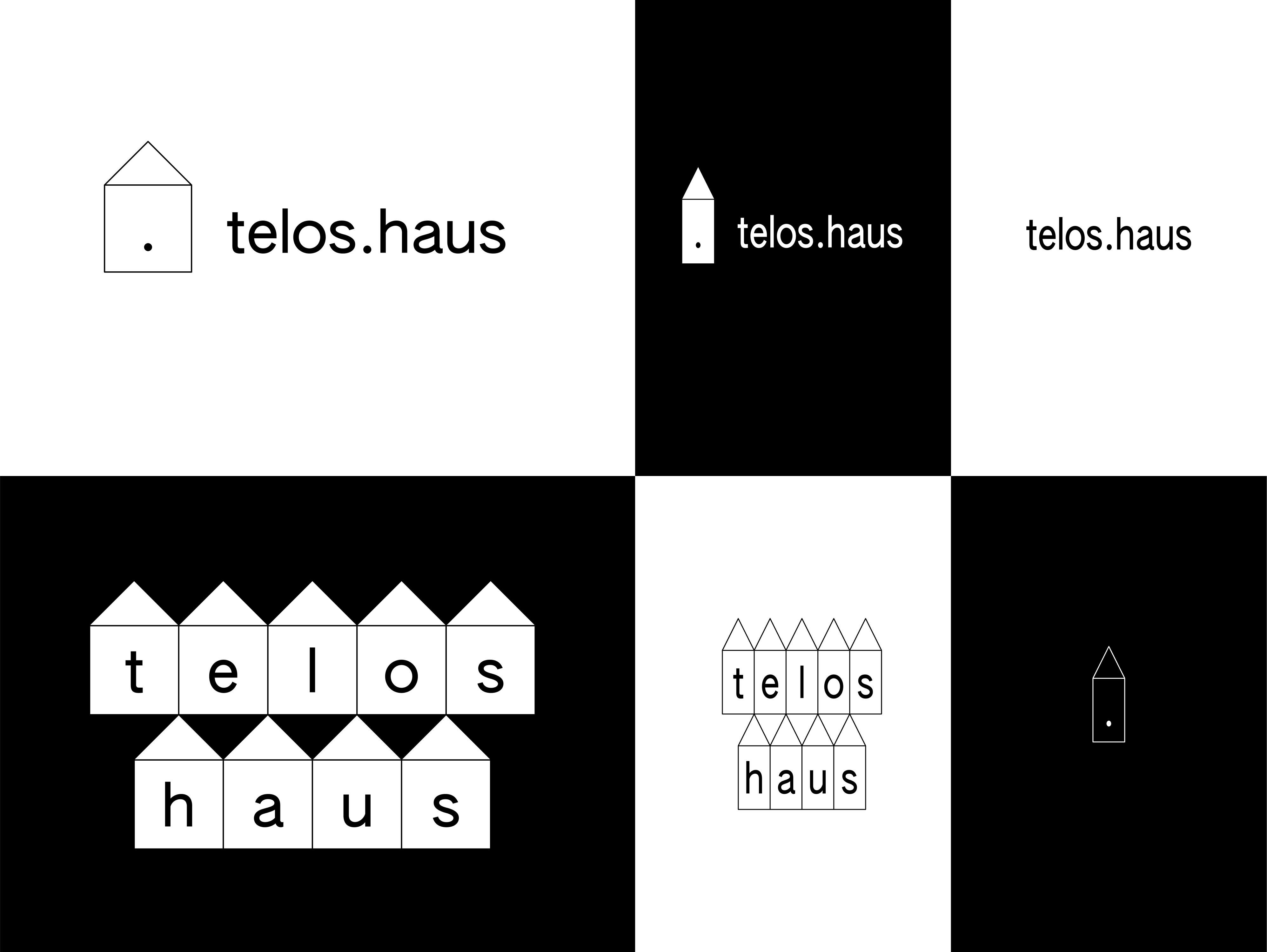
The logo is modular with three main types (stylized wordmark, logo, alternative logo), two variants (outline/full) and two states (wide/condensed). The lowercase wordmark integrates the .haus domain, with the dot functioning as a pause and focus. The house icon marks the platonic ideal of shelter, while the cluster arranges each letter within individual houses for special use cases.
As a nod to telos.haus’ largely Asian American community everything is set in lowercase AUTHENTIC Sans Pro in one size and weight, in condensed on mobile. The typeface by Christina Janus and Desmond Wong is based on the anonymous Latin glyphs included with CJK (Chinese, Japanese, Korean) system fonts.
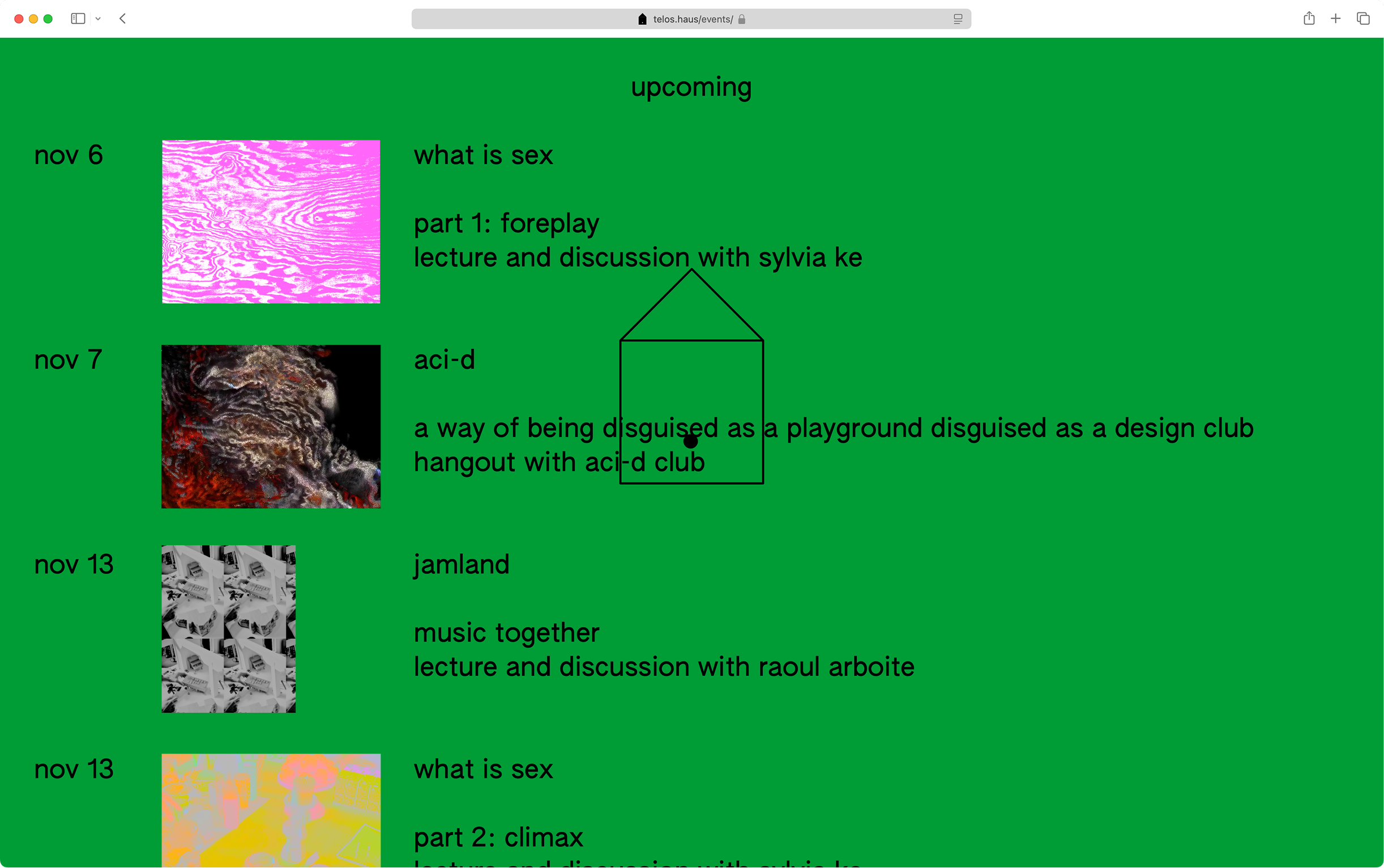
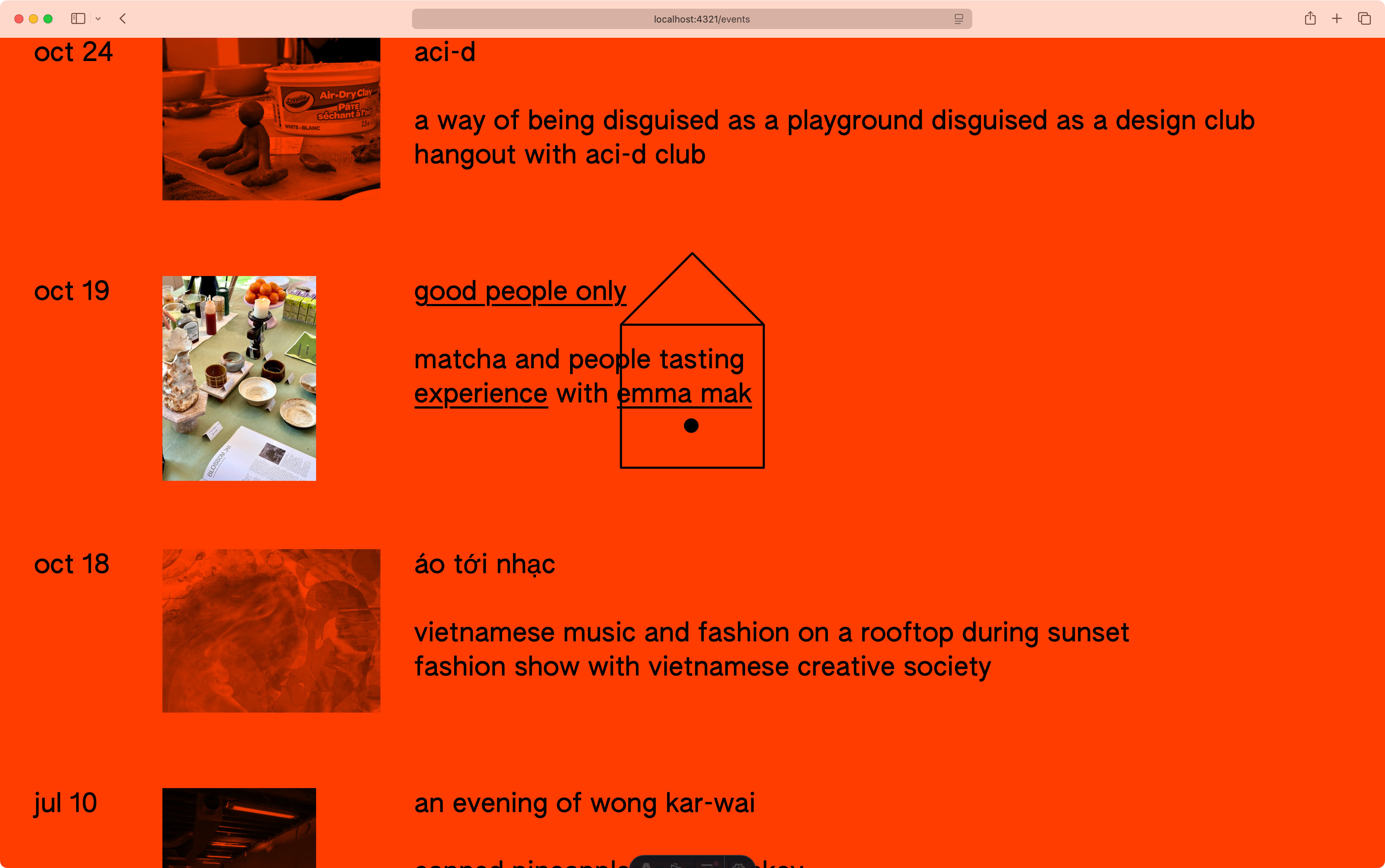
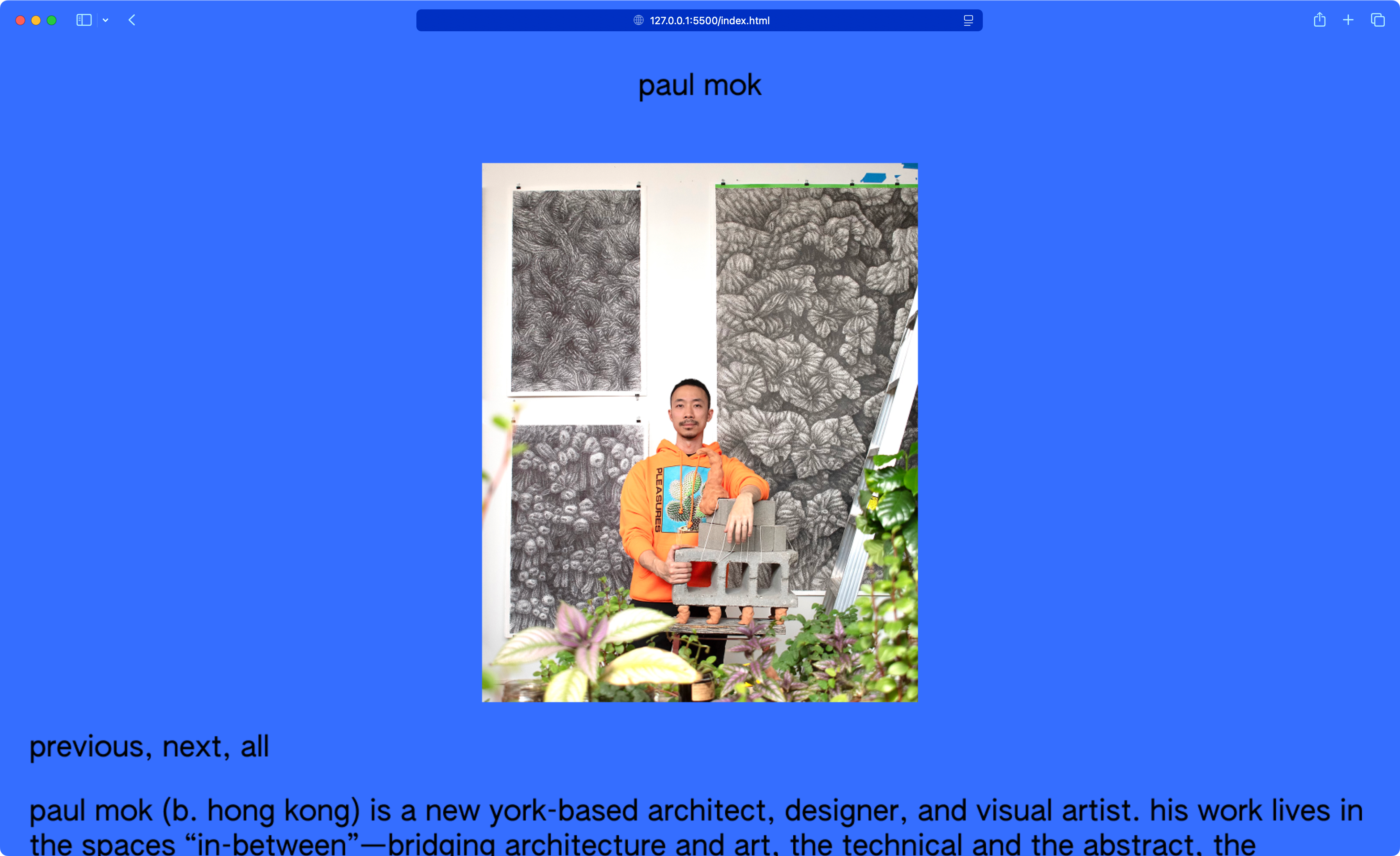
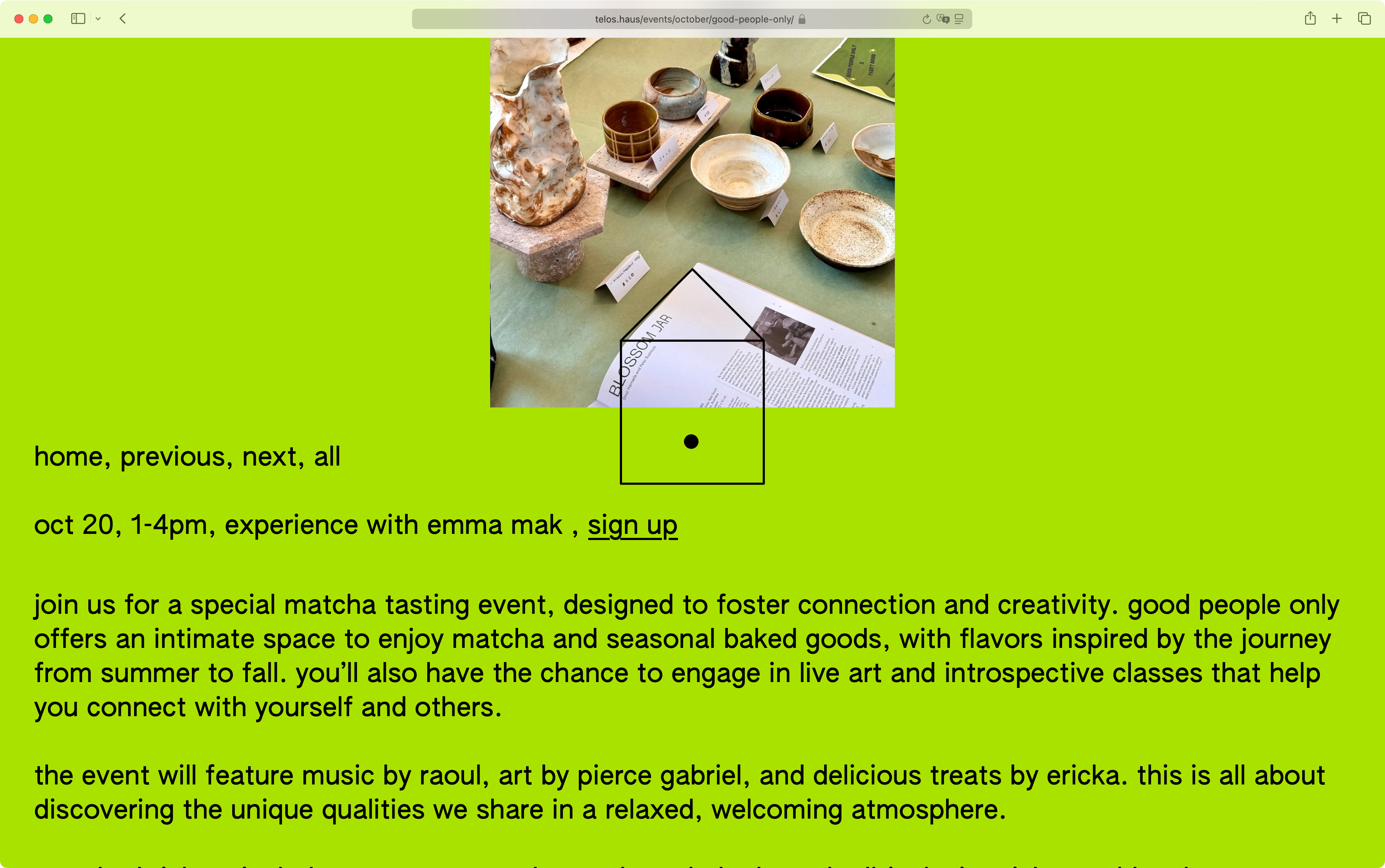
The website acts as a hub—for events, member profiles, and photo documentation. On mobile, a compact logo and adjusted type improve readability. The logo is always fixed, allowing content to flow through. Colors designate spaces and modular components both in web and spatial applicaitons.

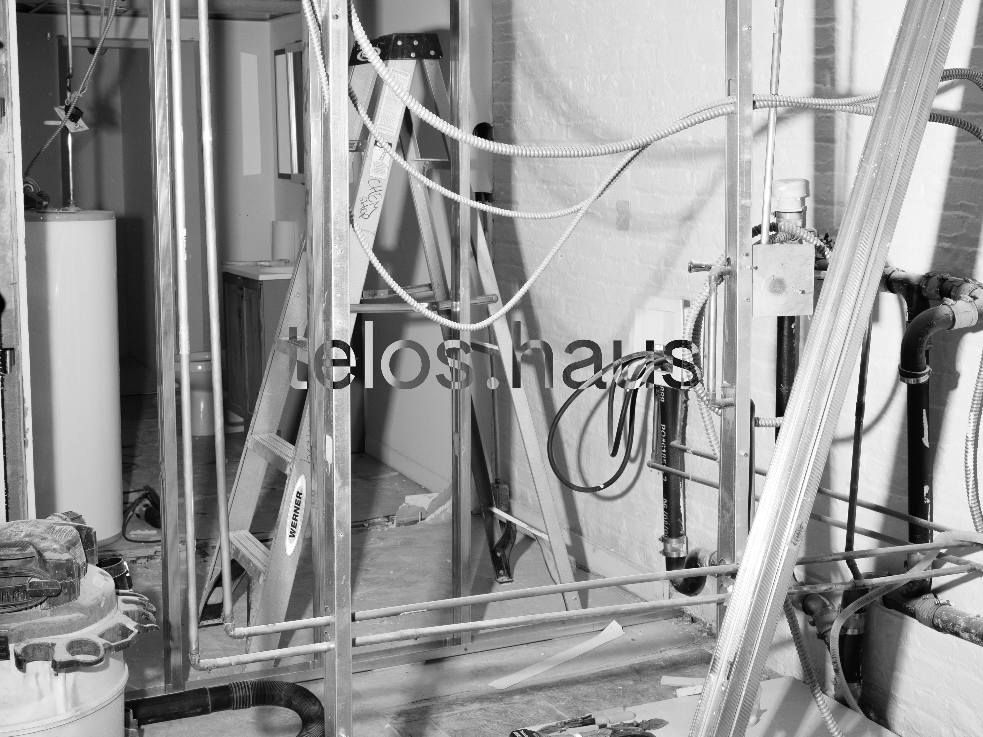
Initial demolition and construction of the space became part of the identity. We commissioned Brooklyn photographer Xi Li to create a series capturing this moment while projecting forward.

The color system gets carried over into print, but with a loose and playful application allowing flexibility in various scenarios.
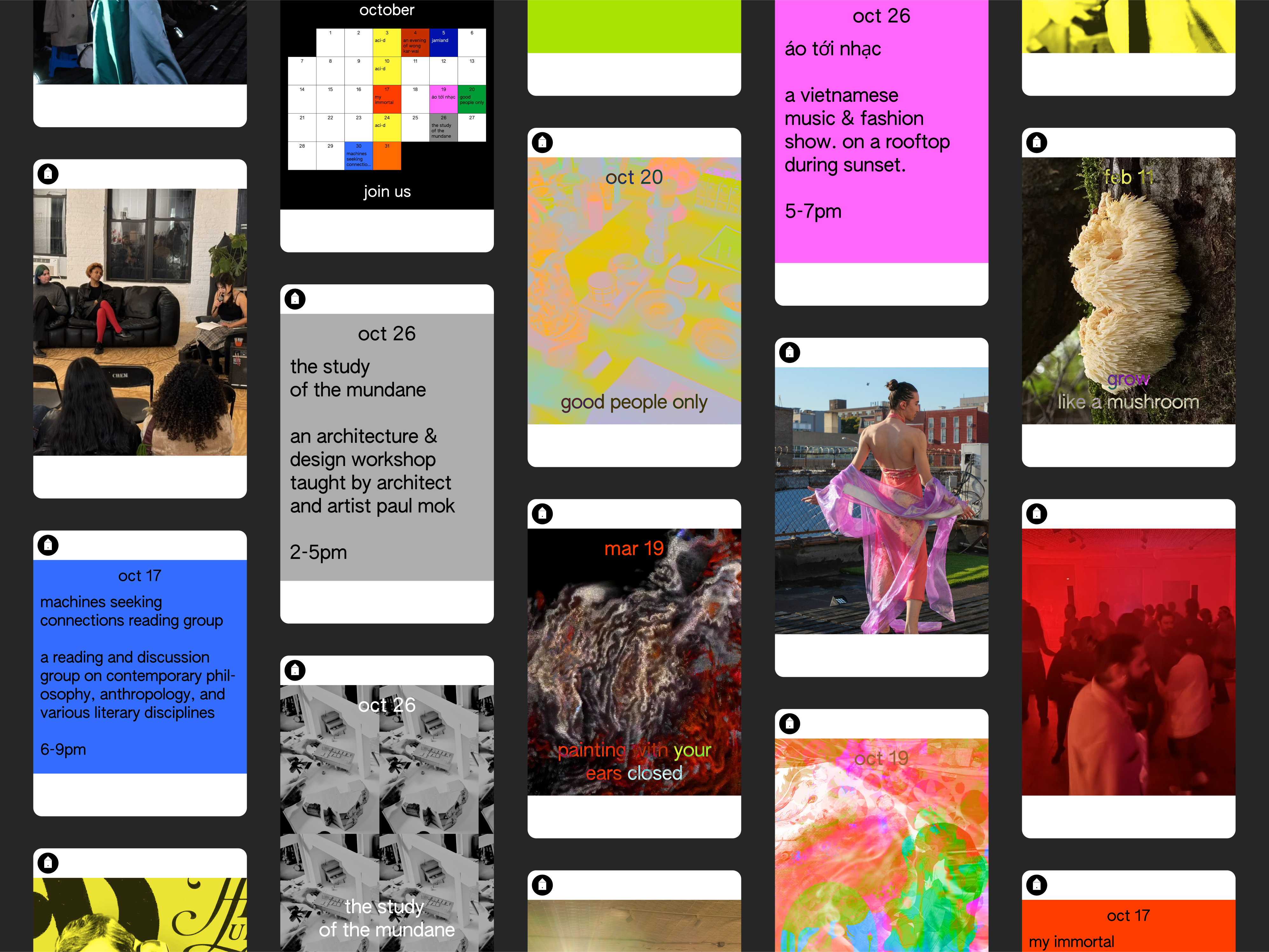
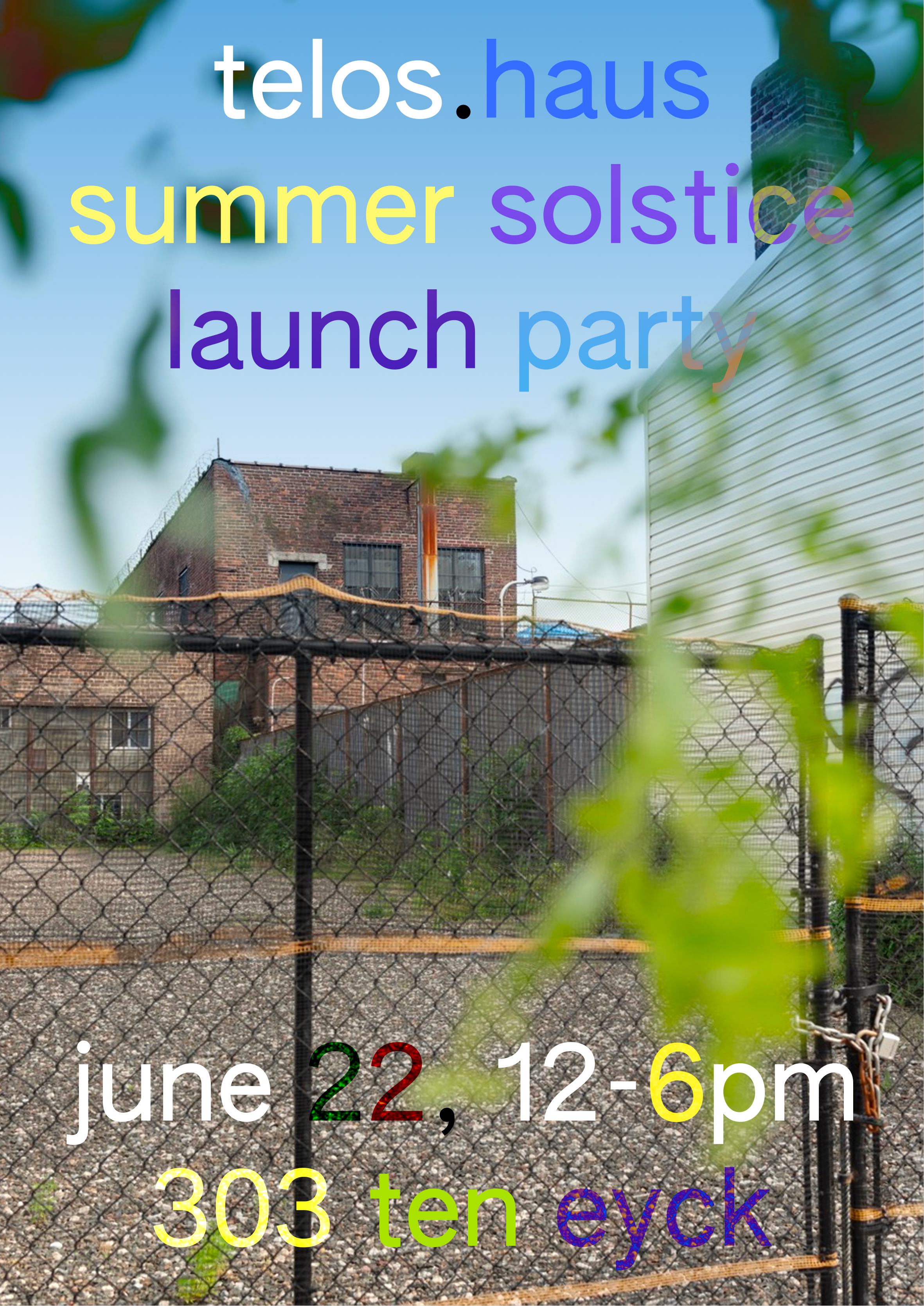
For Social the identity prioritizes immersive content with full-bleed images or color. Type overlays are utility first but allow looser color treatments for play and distinction.
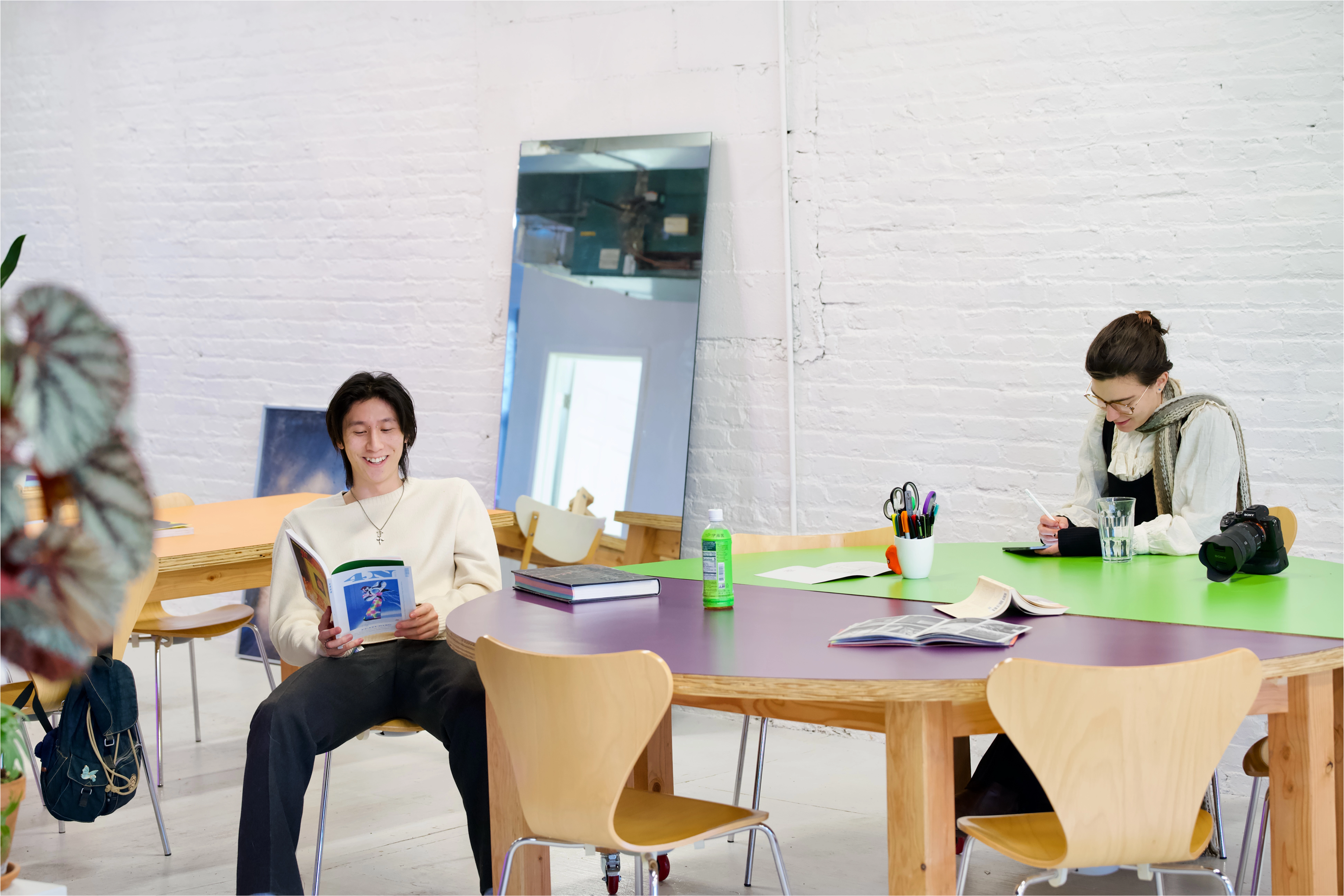
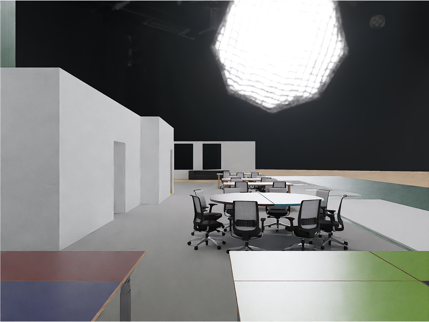
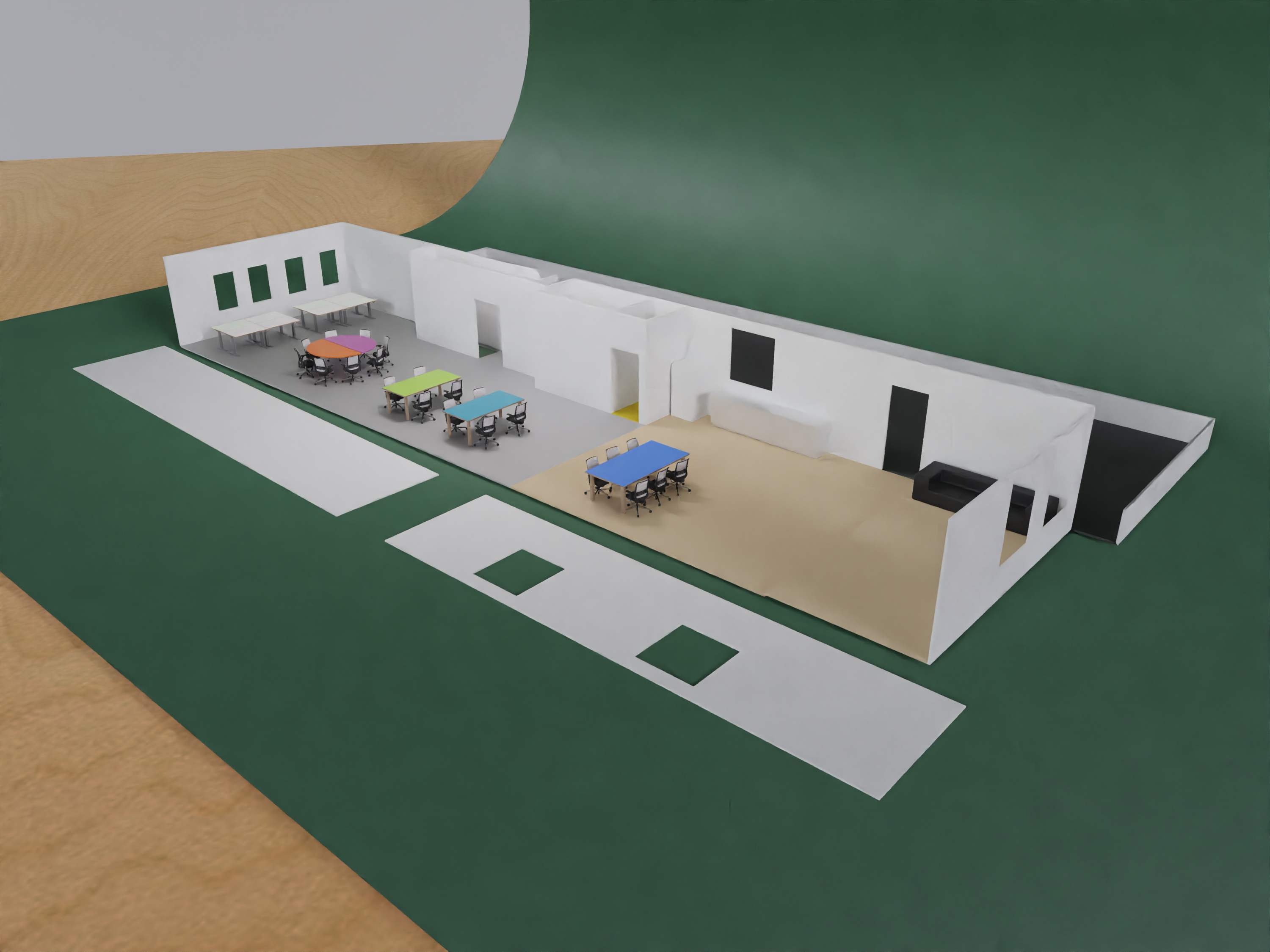
For spatial we focus on raw materials without concealment: brick, concrete, metal, plywood, plastic. Modular furniture on wheels allows for various configurations.
For telos.haus I am building a light-weight identity that stays out of the way, while being front and center at all times. Initially planned as a three month pop-up, it was important to use a ruleset that would fit on a napkin and could be put together by anyone with access to a text editor.
Similarly, the typographic rules are tweet-length: Everything is set in lowercase AUTHENTIC Sans,in one
size and weight. Link underlines are the only empahsis
used. Headlines are centered. The logo stays fixed and centered, always. The same thing for mobile but in condensed.
We wanted the initial demolition and construction phase of the space itself to became a part of the identity. For this we hired Brooklyn based photographer Xi Li to create a series of photos.